🤔 The enterprise-wide enigma
Ask three people on your data team what “total revenue” means and you’ll get three queries. One filters out returns. One rounds before summing. One groups by order date, another by ship date. All three are technically correct, and none of them match.
This isn’t a data quality problem. The data is fine. The problem is that every dashboard, notebook, and BI tool re-implements the aggregation logic from scratch, and nothing stops those implementations from drifting apart from each other.
Standard SQL views don’t fix this. A view locks in its GROUP BY and output columns the moment you create it. If someone wants to slice revenue by region instead of by month, they can’t just re-group the view. They write a new query against the underlying tables, and the drift starts again.
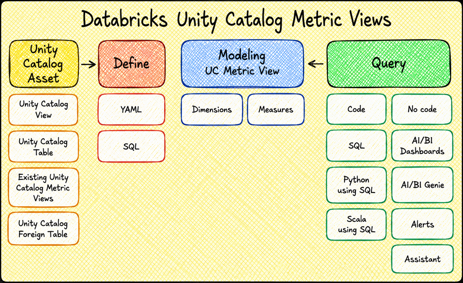
Unity Catalog metric views take a different approach.
They separate what you’re measuring from how you’re grouping it.
Define “total revenue” once, and let people group by whatever field they need at query time. Same metric, same number, no matter who’s asking.
🧱 What a metric view actually is
A metric view is a Unity Catalog object built on five pieces: a source, optional joins, an optional filter, fields, and measures.
Source is the base table, view, or SQL query the metric view reads from. Nothing special here, it’s just where the data comes from.
Joins let you enrich that source with attributes from other tables, most commonly dimension tables. You declare the join condition and the cardinality, and the engine only pulls in the joined table when a query actually needs a field from it.
Filter applies to every query against the metric view, no exceptions. If a metric view should only ever show completed orders, you bake that into the filter once instead of hoping everyone remembers to add WHERE status = ‘completed’.
Fields (also called dimensions) are the things you group and filter by: category, region, order month, status. A field can also be an unaggregated numeric column, like unit price, that gets aggregated later at query time.
Measures are the actual metrics: total revenue, order count, average order value. This is the part that trips people up coming from regular SQL, and it’s worth being precise about. A measure isn’t a fact table, and it isn’t a precomputed number sitting in a column. The source you point a metric view at is your fact table (or something shaped like one). A measure is simply the aggregate expressions you’d compute over the fact table’s numeric columns, things like SUM(revenue) or COUNT(order_id), given a name and made reusable instead of retyped slightly differently in every query. It has no fixed grouping level attached to it, and it only gets evaluated when you wrap it in MEASURE() in your query.
🏗️ Building a small star schema with dummy data
Databricks ships a samples.tpch dataset that most docs use for metric view examples. It’s fine for a syntax reference, but it doesn’t really let you see the “define once, group any way” payoff, because you don’t control the shape of the data. Let’s build our own fact table and dimensions instead, so every field and measure below maps directly to something you just created.
| |
Ten products across three categories, six stores across three regions. Small enough to eyeball, varied enough that grouping by different fields actually produces different-looking results.
The fact table
This is the part worth being careful about. If every row has the same quantity and the same price, every aggregation you run will look suspiciously clean, and you won’t actually be testing anything. So instead of hardcoding a handful of repeated rows, generate a couple thousand with real variance in date, product, store, quantity, and a discount that kicks in on some orders but not others:
| |
That’s 2,000 order lines spread across a full year, ten products at realistic price points, and a discount pattern that hits roughly 60% of orders at different rates. sales_fact is your fact table here, in the Kimball sense: it’s the thing metric view measures will aggregate over.
| |
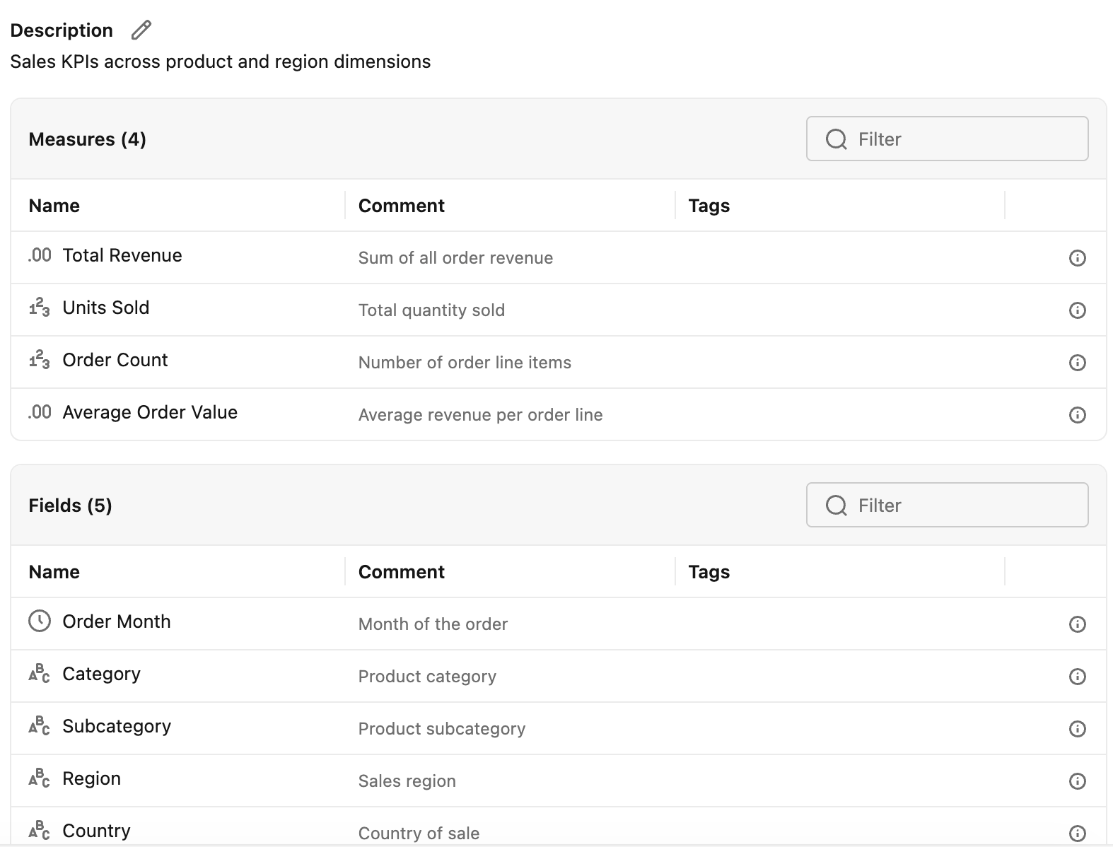
This is how it looks like in Unity Catalog after created
⚡ Where the power shows up
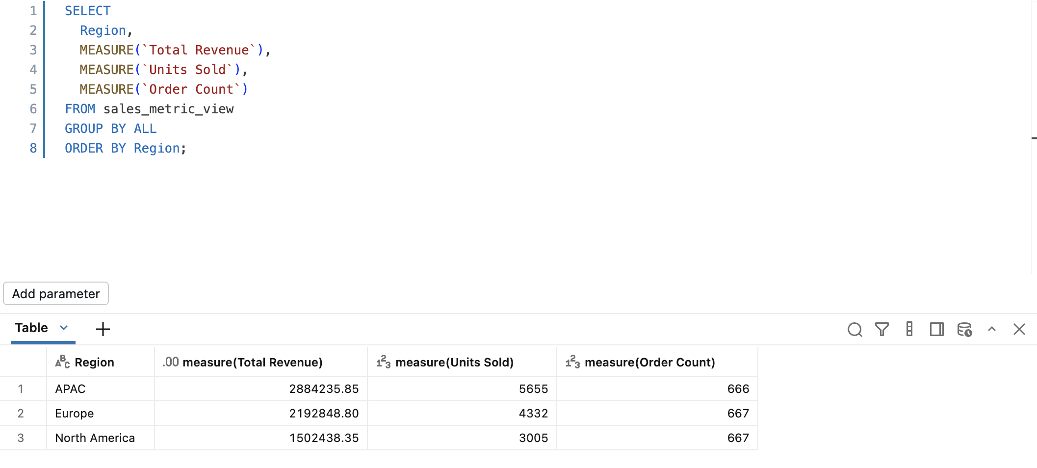
Here’s the part that actually justifies building a metric view instead of just writing four separate queries: every query below reuses the same Total Revenue, Units Sold, and Average Order Value measures. Nobody redefines the aggregation logic. Nobody risks the region cut drifting from the category cut.
Slice 2: by product category
Slice 3: by month, trended over the year
Slice 4: region and category together
Four completely different shapes of output, one region-only, one category-only, one time-trended, one crossed two ways, and not one line of aggregation logic was rewritten to get there. Total Revenue is defined exactly once, in the metric view. Every query just tells it how to group.
Run these against your own sales_metric_view and you’ll see the actual numbers, they’ll depend on the exact dummy data you generated. What matters isn’t the specific figures, it’s that switching from a region cut to a category cut took zero SQL changes to the underlying math. Try doing that with four copy-pasted GROUP BY queries against sales_fact directly, and you’ll either end up hand-maintaining four slightly different SUM(revenue) expressions, or you’ll write a fifth query to double check the first four agree with each other.
That’s the whole pitch of a semantic layer in one paragraph: the grouping is disposable, the metric definition isn’t.
🔍 Querying it (the mechanics)
A few things about querying metric views are different enough from regular SQL that they’re worth calling out on their own.
MEASURE() isn’t optional
Every measure has to be wrapped in MEASURE() to evaluate. Reference Total Revenue without it and Spark won’t treat it as a column you can select:
GROUP BY ALL is your friend
Since fields can be grouped by in any combination, GROUP BY ALL saves you from listing every field name twice. It groups by every selected column that isn’t wrapped in MEASURE().
Filtering on a field works like you’d expect
Fields behave like normal columns in WHERE. Measures don’t, you can’t filter directly on a measure the way you’d filter on an aggregate in a HAVING clause elsewhere, since the aggregation isn’t resolved until the MEASURE() call runs.
No SELECT *
Because measures require MEASURE() to evaluate, you can’t select everything with a wildcard. Every field and every measure has to be listed explicitly. Mildly annoying, but it’s a direct consequence of measures not being precomputed columns.
You can’t join a metric view directly to another table
This one catches people off guard. Say you want sales_metric_view joined to some other table that isn’t already one of its dimensions.
You can’t do this:
The workaround is to resolve the metric view’s measures inside a CTE first, then join the CTE result like a normal table:
| |
Once the measures are resolved in the CTE, it’s just a regular result set. Standard joins apply from there.
🧭 Where it actually fits
Metric views show up in a few places once they exist, worth knowing about but not worth a hard sell.
AI/BI dashboards can point directly at a metric view instead of a dataset built from raw tables. The MEASURE() wrapping happens automatically in the dashboard layer, and anything you’ve added like display names or formatting shows up in the UI.
Genie Agents can use metric views as their data source, which matters more than it sounds. An agent answering “what was our revenue in Europe last quarter” against raw tables has to guess at the right joins and aggregation every time. Pointed at a metric view, it’s just calling MEASURE(\Total Revenue) with a filter, using logic that’s already been defined and checked once.
Alerts can monitor a measure and fire when it crosses a threshold, same idea as alerting on any other query result, just backed by a metric that’s guaranteed consistent with what’s on the dashboard.
External BI tools like Power BI, Tableau, and Sigma, plus JDBC/ODBC and the Excel and Google Sheets connectors, can all query metric views too. That matters if your organization already has reporting built outside Databricks and you don’t want a second, disconnected definition of the same metrics living there.
None of this replaces good data modeling upstream. A metric view is only as trustworthy as the fact and dimension tables it sits on.
What it does is stop the same metric from being reinvented, slightly differently, in every tool that touches it.
🏢 Why not just build this in Power BI?
Worth addressing directly, since this is what most companies already do. The standard pattern is Power BI dataflows and DAX measures defined right inside the Power BI semantic model, per dataset, sometimes per workspace. It works, until it doesn’t scale past one team.
The problem is where that logic lives. A DAX measure for "total revenue" defined inside a Power BI dataset is only reachable from Power BI. The moment someone needs the same number in Tableau, in a Genie Agent, in an ad hoc SQL query, or in an alert, they're rewriting that logic from scratch in a completely different language, with no guarantee it matches. Multiply that across workspaces and datasets, and you get exactly the drift problem from the start of this post, just moved one layer downstream and harder to spot because it's buried inside Power BI's model instead of in a SQL query someone can read.
There’s also a data movement cost that’s easy to miss. Power BI dataflows and import-mode datasets pull a copy of the data out of the lakehouse and into Power BI’s own storage, then refresh it on a schedule. That’s a second copy of your data, a second place it can go stale, and a second thing to govern access to. A metric view keeps the data and the metric definition in the same place, Unity Catalog, and Power BI just queries it live through DirectQuery-style access, governed by the same permissions as everything else in the lakehouse.
📈 How this scales across large organizations
This is also where the approach earns its keep at scale that a single team's DAX model never will. A company with a hundred analysts across a dozen business units doesn't have a "reinvent the metric" problem, it has a hundred versions of that problem running in parallel.
Every new dashboard, every new BI tool a team adopts, every new Genie Agent someone stands up, is another place “total revenue” could quietly diverge, and there’s no realistic way to audit all of it by hand once you’re past a handful of teams.
Centralizing the definition in Unity Catalog turns that into a governance problem instead of a reconciliation problem. One metric view, one set of permissions controlling who can read or edit it, one place to check when someone asks “why does this number look different.” Add a new team, a new tool, a new dashboard, and they inherit the existing definitions instead of writing their own. The metric logic scales the way the data platform already scales, through governance and reuse, rather than through every team independently getting the SQL right and hoping it stays that way.
None of this means Power BI becomes less useful. Report-level calculations, running totals for a specific visual, formatting for a specific page, that’s still exactly where DAX belongs. What shouldn’t live in Power BI alone is the definition of what “total revenue” or “active customers” means for the business. That belongs in one governed place, reused by whatever tool asks for it, Power BI included.
✅ Wrap-up
A metric view solves one specific problem: the same business metric getting slightly reinvented every time someone new needs it.
Fields describe how you’re allowed to group your data, measures describe what you’re calculating, and the two stay separate until someone actually runs a query. Group by region today, by category tomorrow, and the underlying revenue number never drifts between the two.
That’s worth the setup cost when a metric genuinely needs to be consistent across tools and teams, revenue, active users, whatever ends up on an exec dashboard and in a Genie Agent’s answer on the same day. It’s probably overkill for a one-off analysis nobody else will touch.
If you’re running Power BI dataflows today and haven’t hit the “which number is right” problem yet, you likely will once a second team starts asking the same question a different way. Metric views are one way to get ahead of that before it becomes a mess to untangle.